
Canister: A client management tool for photographers.
Google UX Design Certification
The assignment for this certification course project was to design an app. I was prompted to design a client management app, specifically for photographers. This app, which I named Canister, allows photographers to organize their image assets, schedule photoshoots with their team, and share photos with clients and stakeholders.
TIMELINE
October 2021 thru December 2021
CLASS
Google UX Design Certification
DELIVERABLES
Usability study
App prototype
App mockup
MY ROLE
Lead and sole UX Researcher and Designer
CONDUCTING USER INTERVIEWS
At the beginning of the project, I conducted user interviews with a number of individuals who would be likely to use a photography client management app. After synthesizing the feedback from my interviews, I came away with the following key user pain points:
DEVELOPING USER PERSONAS
Based on my initial research, I created personas to help focus my design. For this project, it was important to create a persona representing a client using the app to look at the photos they’ve purchased, as well as a photographer using the app to manage their business. This would ensure that I was making the app usable and useful for everyone.

PERSONA A: Steven
Steven is a freelance photographer, filmographer, and drone pilot. He does photography for nonprofits, schools, and corporations, and often travels for work.
PERSONA B: Joan
Joan works in communications, where she produces videos and creative directs photography for clients. She’s often on the go, but has little familiarity with photo sharing apps.
CONDUCTING A COMPETITIVE AUDIT
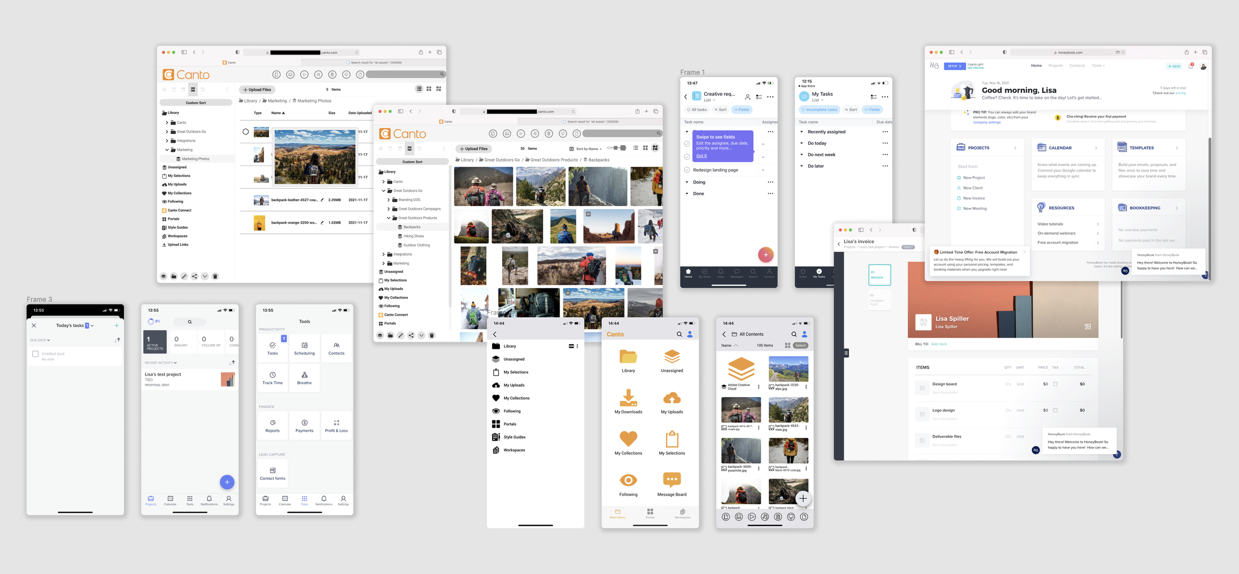
For my competitive audit, I studied many direct and indirect competitor apps, and chose to do a deeper dive on a select few. For direct competitors, I looked at SmugMug and Honeybook, and for indirect competitors I looked at Asana, Canto, and Dropbox.
STORYBOARDING THE EXPERIENCE
To help visualize how this app would function in a user’s every day life, I developed big picture and close-up storyboards. For the big picture storyboard, I used my A persona, Steven the photographer, who is using the app while in the field on a photo shoot. For the close-up storyboard, I used my B persona, Joan the marketing executive, who is sharing assets with her team from the app.
BIG PICTURE STORYBOARD
CLOSE-UP STORYBOARD
ESTABLISHING THE SCREEN FLOW
For each screen, I prioritized the workflow of the user, because I knew that the app would be used on the go, during photoshoots. A priority was making sure that all tools were accessible at all times, and that the flow from one screen to the next was logical and intuitive.
IDEATING LAYOUT DESIGNS
Because I love to draw, I used the Crazy 8s method to create concepts for the home screen. One of the main goals to keep in mind for the home screen was to provide easy access to every tool the app had to offer.

WIREFRAMING
For the initial wireframes, the goal was to create a clear and readable design that included as much real text and plain English direction as possible. The key function of this app is project management, so the layouts include many features to help users stay organized.

USABILITY TESTING
To test the functionality of the app, I conducted moderated usability studies with six volunteers, including an actual photographer. The tests lasted about 15 minutes each, and were held over Zoom and recorded for later analysis.
During the test, users were asked to carry out basic tasks within the low-fidelity mockup. The study script included tasks and questions like: “Open the app and navigate to the Projects page,” and “If I asked you to share this album with the client, would you know what to do?”
After the interviews were complete, I transferred each insight onto a sticky note and created an affinity map to help focus my revisions.
USABILITY IMPROVEMENTS
I tested the low-fidelity prototype on six users, including an actual photographer. I synthesized their feedback and incorporated the results into later design iterations. Their feedback greatly improved the usability of the app.
DESIGN IMPROVEMENT #1
A major block for users in testing was being able to find the “share” button to share an album. After testing, the “share” design was made more prominent and support text was added.
DESIGN IMPROVEMENT #2
Users were very confused by the event creation flow during testing. Upon revision, extra confirm steps were removed, and more instructive text was added to the design.

STYLING HIGH-FIDELITY SCREENS
WRAPPING UP
Having wrapped this project, there are two distinct changes I would make, had I had more time:
ENGINEERING: If this were a real app, I would have enlisted the help of an engineer right at the beginning. I would have brought them on as a thinking partner to ensure that all of the app features were feasible.
A GAP IN THE RESEARCH: After completing this project, I learned about the Canon Connect app. While conducting my initial research, I had missed this app altogether. I encountered the app in the real world, while on a photoshoot, and it was extremely helpful for me and the other members of the team to be able to review the photos in real time. If I could go back, I would have incorporated the Canon Connect features into my research, and would have added a live view feature to Canister.